Perspectives
Supply Chain Dashboard: 12 KPIs Most Teams Track Too Late
By Supply Signal | June 1, 2026 | 9 min read
Most supply chain dashboards are honest about what happened and quiet about what is about to. By the time on-time-in-full drops or inventory days swing, the cost has already landed. The question worth asking of any dashboard is not which KPIs it shows — it is how many of them can still be acted on.
The 12 metrics below appear on nearly every supply chain dashboard in the market. They are the right things to measure. They are also, almost without exception, lagging by construction. This piece walks through what each one captures, why the standard dashboard layer fires too late to prevent the disruption it is meant to surface, and what a leading-indicator layer looks like alongside it.
What a supply chain dashboard actually shows today
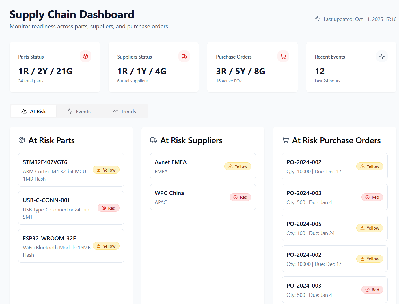
A supply chain dashboard is a single view that consolidates operational and financial metrics across procurement, inventory, manufacturing, and logistics. In most organizations it is built on top of an ERP feed, a transportation management system, and a warehouse management system, with a BI layer on top. The dashboard's job is to answer three questions: are we hitting service levels, are we holding the right inventory, and is the cost-to-serve trending in the direction we committed to.
The metrics that earn space on the screen fall into four buckets — cost, service, inventory, and risk. The buckets matter because they map cleanly to who acts on the number: finance owns cost, customer-facing teams own service, planning owns inventory, and procurement owns risk. A well-built supply chain metrics dashboard surfaces all four to a single operating cadence, usually weekly or daily.
What it does not do, in most implementations, is tell anyone what to do tomorrow. The dashboard is a rear-view summary. That is useful — and insufficient.
The 12 KPIs most teams track
Below are the 12 KPIs that appear on roughly every supply chain KPI dashboard we have seen, grouped by what they govern. Each is paired with the canonical formula and a one-line note on what it actually moves in response to.
Cost metrics
- Cost per order shipped. Total fulfillment cost ÷ orders shipped. Moves with freight rates, labor, and pick efficiency.
- Cost of goods sold (COGS) as % of revenue. COGS ÷ revenue. Moves with input prices and product mix.
- Freight cost per unit. Total freight spend ÷ units shipped. Moves with mode mix, lane mix, and carrier contracts.
Service metrics
- On-time in full (OTIF). Orders delivered on time and complete ÷ total orders. The headline customer-facing number.
- Order cycle time. Average elapsed time from order placement to delivery.
- Perfect order rate. Orders delivered on time, complete, undamaged, with correct documentation ÷ total orders.
Inventory metrics
- Inventory days of supply. Average inventory on hand ÷ average daily usage. The single most-watched planning number.
- Inventory turnover. COGS ÷ average inventory value. The same idea expressed as turn-rate.
- Stockout rate. SKU-locations stocked-out ÷ total SKU-locations. Service consequence of planning error.
Risk and supplier metrics
- Supplier on-time delivery. POs received on or before promised date ÷ total POs. Per-supplier scoreboard.
- Average supplier lead time. Mean time from PO issued to PO received, by part and supplier.
- Single-source exposure. Spend or BOM lines with one qualified supplier ÷ total spend or BOM lines. The standard risk flag.
This is the standard payload. If a supply chain performance dashboard is missing more than two of these, it is incomplete. If it shows all twelve, it is doing its job — within the limits of what a lagging-metric dashboard can do.
Leading vs lagging: why these KPIs fire too late
Every metric above describes something that has already happened. OTIF measures shipments that already missed. Stockout rate measures orders already lost. Average supplier lead time measures POs already late. Single-source exposure flags a BOM structure, not a supplier that is about to be put on allocation next quarter.
This is not a flaw in the metrics. It is a property of where the data comes from. ERP, TMS, and WMS systems record transactions after they occur. A dashboard built on those systems will, by construction, surface the consequence rather than the cause. The standard fix — refreshing the dashboard more often — does not change the input. A faster lagging indicator is still a lagging indicator.
A leading-indicator layer pulls from a different class of source: signals that move before the transactional record exists. The categories that matter in practice:
- Foundry and supplier allocation language. The phrasing on a foundry's quarterly earnings call shifts before the allocation letters arrive. Portfolio-mix and capacity-rationalization language correlates with constrained output one to two quarters ahead.
- Distributor inventory turns. Public distributor inventory metrics turn ahead of the supplier price moves that flow into your contracts. Compressed turns at the channel level precede lead-time stretching.
- Freight-rate inversions. Spot vs contract divergence on key lanes typically appears 4 to 8 weeks before published rate cards move. The dashboard sees the rate increase. The inversion happens earlier.
- Capex and clean-room buildout disclosures. Multi-year supply for capacity-constrained components is set by capital plans disclosed years ahead. Capex announcements are public; very few procurement systems consume them.
None of these are exotic. All are public. The reason they rarely make it onto a supply chain dashboard is that they do not arrive in the same shape as ERP records — they are unstructured, asynchronous, and require interpretation. The dashboard layer can absorb them, but only with a parallel data pipeline built for that purpose.
The dashboard software landscape
Tools that surface the 12 KPIs above fall into four broad categories. None of them are wrong; each is built for a different starting point.
- BI generalists. Platforms like GoodData and ThoughtSpot give a flexible canvas to model whatever the data team can pipe in. Strongest when there is an analytics team that owns the dashboard.
- Visibility platforms. FourKites, project44 and similar focus on in-transit and multi-tier shipment visibility. Strongest for logistics-heavy operations with significant inbound complexity.
- ERP-native dashboards. NetSuite, SAP IBP and equivalents ship the dashboard layer alongside the system of record. Strongest when most of the relevant data already lives in one ERP.
- Predictive intelligence layers. A smaller category — including Leadtime — that sits alongside the dashboard rather than replacing it, consuming public allocation, capex, and supplier signals to surface constraints before the lagging KPIs move. Strongest for component-constrained BOMs in automotive, medical, and industrial supply chains.
The category choice is downstream of one question: is the dashboard there to report on the past quarter, or to change what happens in the next one. Both are legitimate. They are not the same job.
Frequently asked questions
What is a supply chain dashboard?
A supply chain dashboard is a consolidated view of the operational and financial metrics that govern procurement, inventory, manufacturing, and logistics. It typically pulls from an ERP, TMS, and WMS, and surfaces cost, service, inventory, and risk KPIs against targets on a daily or weekly cadence. Its purpose is to give cross-functional teams a single source of truth for performance against plan.
What KPIs go on a supply chain dashboard?
The standard set covers four buckets: cost (cost per order, COGS as % of revenue, freight cost per unit), service (on-time-in-full, order cycle time, perfect order rate), inventory (days of supply, inventory turnover, stockout rate), and risk (supplier on-time delivery, supplier lead time, single-source exposure). Twelve KPIs across those buckets is a typical and complete payload — though all twelve are lagging indicators by construction.
How is a KPI dashboard different from a metrics dashboard?
The terms are used interchangeably in most organizations. Where teams draw a distinction, a KPI dashboard usually shows a small number of headline metrics with targets and variance, intended for executive review, while a metrics dashboard exposes the broader underlying operational data that planners and analysts work with day to day. The data sources and definitions are the same; the audience and density differ.